The road to an accessible and validated web page
Picking the colors
We went a little bit back and fourth during early development on how the overall color theme for the site should be, with the focus being legibility. We wanted strong contrasts between text and background, accompanied with a simple sans-serif typeface (such as Arial). We tried some classic dark-mode inspired color matchings (dark background, bright text), but ended up deciding on using the exact color pairing that parts of the OsloMet pages use - we thought it looked quite good, and thematically fitting, with the page being a final assignment of our first semester at this university.
We ran a color contrast test for good measure at color.a11y.com/Contrast - No issues found. The #222 and #ffd500 colors (OsloMet black and yellow) were displayed as GOOD contrast color-pairs, confirming our thoughts.
Development and manual testing
When we started developing the page, we focused on small screen first, and then expanded to bigger screen sizes second. We designed it with screens as small as 360px width in mind (this was the narrowest screen size among our phones), but later added support for even smaller screens, to support users with visual impairments.
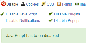
We made sure the page would function without javascript enabled - we used the noscript tag to make the navigation menu be always visible and also not overlap the main content, on small screens. In addition, we tested the page with CSS disabled, and it rendered in a fully functional format.
Finally, we made sure that navigating the page with only the keyboard works fine, and logically - the visual layout matches the structural layout, being ordered from top to bottom and left to right.
Using testing tools
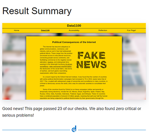
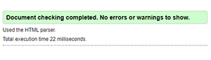
We ran two different free Web Accessibility tests at webaccessibility.com and deque.com. Neither returned any errors. Finally, we ran all of our code through the w3c markup and css validators, and made sure to correct any of the errors that occured (only a few minor things, thankfully).